 |
| Source |
Saturday, March 26, 2011
Taking Old and Making it New
Wednesday, March 16, 2011
It's a Jungle In Here

This is another "clipping" that I found in a Victoria's Secret catalog that was sent to my home about a few days ago. As I've said before, they always have some very creative uses of type and pictures that I've seen. This type of emphasis on parts of the phrases were used throughout the catalog, taking nouns (ex. jungle) and making them a san-serif font, using a different color (ex. pink), and uppercase; while the rest of the phrase would be in a serif font. I believe it's the small design tricks that make it memorable and stand out from the rest.
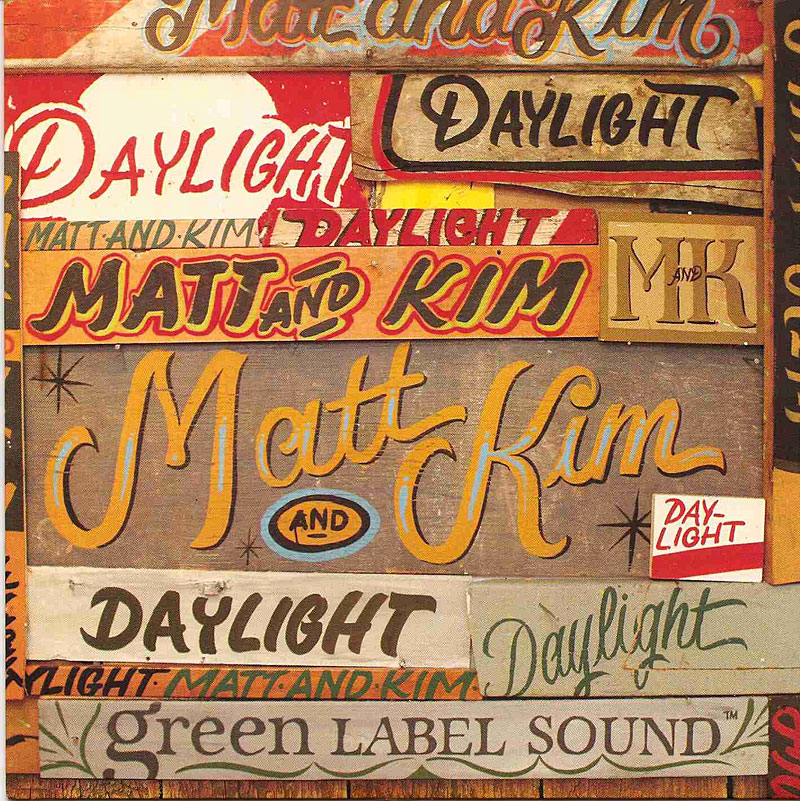
Wednesday, March 9, 2011
Definitely In the Daylight
 |
| Source |
Wednesday, March 2, 2011
Feminine/Masculine Cliche
 |
| Source: Typeforce / The Annual Chicago Show of Emerging Typographic Allstars Feb/March 2010 issue |
This is a customized screenprint poster called Feminine/Masculine, created by Delicious Design League's Billy Baumann and Jason Teegarden-Downs. What Billy and Jason wanted to do was try and take away the social conventions and norms of what it means to be feminine and masculine, possibly changing the ideal of what it means to be male and female. I think that this definitely succeeds because we normally wouldn't associate femininity with words like strong and bold and masculine with elegance and gentleness (both typefaces showcased just that). It's definitely on a different take and makes me wonder about what the definition of femininity and masculinity does exactly mean (especially in today's society).
Wednesday, February 23, 2011
Victoria Has Many Secrets

Even though catalogs come in the mail all the time, from the stores you've never heard of to Lands 'End, I always look forward to the Victoria's Secret catalogs. Not just because of looking at the clothes, but I love seeing their design work. I can't identify this type, so I assume it's handmade just for this particular catalog. I love how it's chic in it's own way, portraying the essence of their brand and the catalog mailed to me at my house. Though it's not the most perfectly written font without a baseline, this is a reason why I like it; because it looks someone's handwriting and people don't normally have a baseline for it. Keep an eye out for Victoria's Secret because they definitely have great designs (and clothes!).
Wednesday, February 16, 2011
The King of Social Networking Sites
| Source |
This is the Facebook logo/wordmark, which I believe definitely creates an impact. You know what it is from just looking at the wordmark with it's cleanliness and simplicity. I would definitely aspire to create a logo/wordmark like this for our next project. The font they use has been hard to identify, but many are saying that Klavika is the font of their choice (modifying the font a bit).
Monday, February 14, 2011
Research - Project 2
 |
| Source - LogoLounge: 2000 International Identities by Leading Designers by Catharine Fisher and Bill Gardner |
For this particular logo, it was designed for Feed Magazine, which is very well-executed in the logo! The idea of having the two e's connect in that way represents the idea of the two e's feeding off of each other. It's also a very simple san-serif font and nothing else needs to be incorporated into it.
 |
| Source |
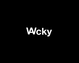
This logo is for the word Wacky, in which is actually very cool! I love how it's another very simple san-serif logo and it has the W and the A together! It's so clever, yet very readable as to the meaning.
 |
| Source |
Subscribe to:
Posts (Atom)