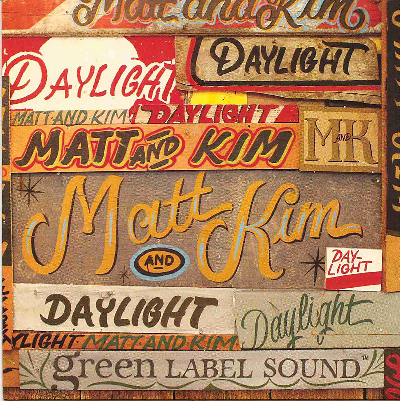
This is a single's cover to a duo called Matt and Kim's song "Daylight". I found this one very fascinating to look at, because of not only the variety of colors, but some of the typography choices they made and the placement of each of the pieces. For me, the viewer can tell very easily what the name of the duo and song are still (even though some of the content is repeating and hierarchy may be tested). I think my favorite "pieces" would be the monogram version of their name and the Matt and Kim that's golden and is the most prominent; then the Daylight that is scripted and green (near where the Green Label Sound is - though it's very cool as well). I believe that each of these stand out on their own, but yet feel like the cover would be missing without one of the them.
No comments:
Post a Comment