 |
| Source |
Saturday, March 26, 2011
Taking Old and Making it New
Wednesday, March 16, 2011
It's a Jungle In Here

This is another "clipping" that I found in a Victoria's Secret catalog that was sent to my home about a few days ago. As I've said before, they always have some very creative uses of type and pictures that I've seen. This type of emphasis on parts of the phrases were used throughout the catalog, taking nouns (ex. jungle) and making them a san-serif font, using a different color (ex. pink), and uppercase; while the rest of the phrase would be in a serif font. I believe it's the small design tricks that make it memorable and stand out from the rest.
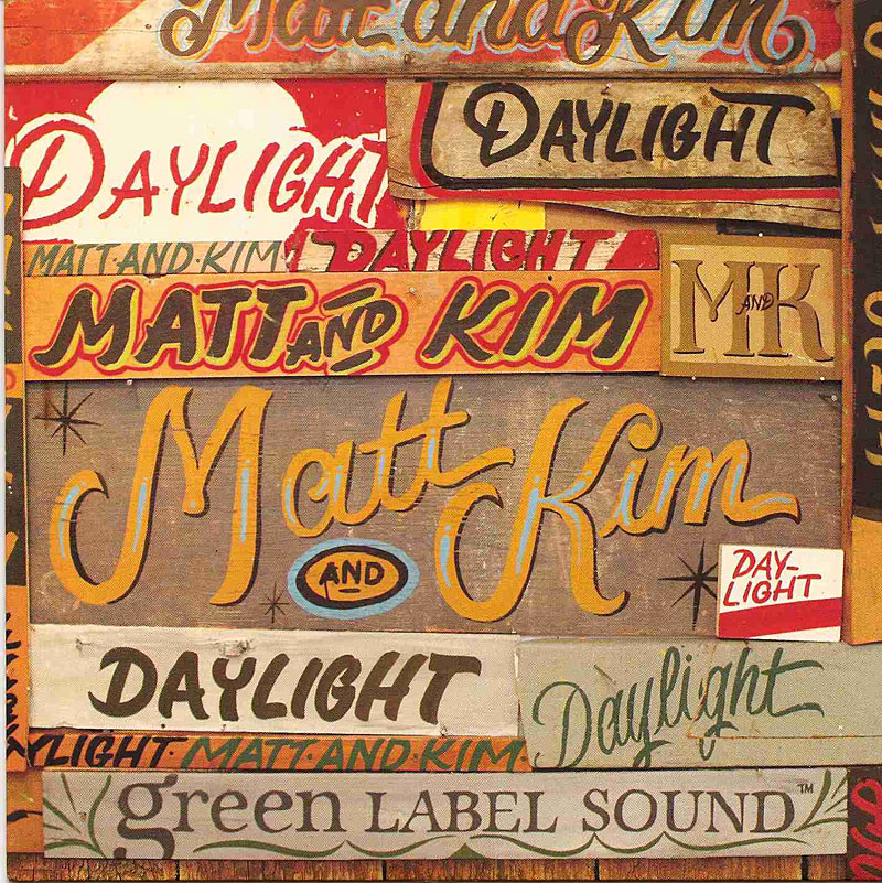
Wednesday, March 9, 2011
Definitely In the Daylight
 |
| Source |
Wednesday, March 2, 2011
Feminine/Masculine Cliche
 |
| Source: Typeforce / The Annual Chicago Show of Emerging Typographic Allstars Feb/March 2010 issue |
This is a customized screenprint poster called Feminine/Masculine, created by Delicious Design League's Billy Baumann and Jason Teegarden-Downs. What Billy and Jason wanted to do was try and take away the social conventions and norms of what it means to be feminine and masculine, possibly changing the ideal of what it means to be male and female. I think that this definitely succeeds because we normally wouldn't associate femininity with words like strong and bold and masculine with elegance and gentleness (both typefaces showcased just that). It's definitely on a different take and makes me wonder about what the definition of femininity and masculinity does exactly mean (especially in today's society).
Subscribe to:
Posts (Atom)