Sunday, April 17, 2011

Is It Type?!

Source
I always find it interesting to look at different posters, book covers, etc.  I ran into this poster, which was created by Lennart Wolfert Grafisch.  You can check out the poster on his website here.  I think it's so creative because it uses different letters, punctuation, etc. to create the regular letterforms.  Trying to determine what typeface they used for the punctuation in order to create this piece is very hard, since they warped many of the numbers to fit the letterform (ex. the 7 creating the question mark).  If it were me, I would say the because it's readable, has the same x-height and is consistent, it's a typeface.  One could argue differently.  It's a very clever design, but my only complaint is the e's should've been more cleverly written.  Definitely a typeface!

Wednesday, April 13, 2011

Is It The Last Day?!

Source
I always like to look at Smashing Magazine for inspirations and came upon this book cover.  It's a very intriguing use of the Courier New type, incorporating the old-fashioned way of correcting papers into the theme that publishing may no longer exist (since everything has been going to eBooks or PDFs).  The reason why it's so effective is because how the type is cropped, some handwritten to make it feel like the teacher correcting a paper.  Though it's somewhat confusing because of all the lines in it, it still gets the point across and highlights the most important points (the title and author).  Now to steer off the subject, I don't think publishing will ever go out of style because some (like myself) that likes to not look at the computer screen all day.  Let's not underestimate the power of holding a book in your hand.

Wednesday, April 6, 2011

Limb Design

Source:  Letterhead & Logo Design by Sussner Design Co.

This is a company wordmark/logo design in which works really well.  I think what draws the viewer in is not only the little branch looking out of the window, but the great font choice.  It makes the person feel like they're going to get a design in which is authentic, contemporary, and will bring out creativity (especially if you look at the letterhead, business card and envelope design.  It's simple, effective, and gets the point across.  I want to thank Johnathon for letting me borrow this book.  It's been a great source of inspiration!  =]

Source:  Letterhead & Logo Design by Sussner Design Co.

Saturday, April 2, 2011

It's Definitely Extraterrestrial


I was trying to find the official version of Katy Perry's new single, E.T. and I came upon this user created lyric video.  All of the lyrics are typed in different futuristic, modern, and innovative type that goes along with the song.  The user also not only combines different type together, but has great motion effects without feeling disruptive.

My favorite type used in the video would be in the "Extraterrestrial", "Kiss Me, Ki-Ki-Kiss Me", and "Take Me, Ta-Ta-Take Me" parts.  Especially when it comes to the motion in the "Kiss Me, Ki-Ki-Kiss Me" part.

Saturday, March 26, 2011

Taking Old and Making it New

Source
This is a new movie that is coming out called Jane Eyre.  I'm sure many have heard of the book (which I really didn't until I had seen the movie trailer on television).  So I went online to look up what the movie/book was about and had seen the poster.  Not only is the artwork fantastic on it, I think the type (though very simple) brings out a contemporary and dynamic effect.  The font they used I believe is Helvetica Neue Ultra Light from what WhatTheFont.com had said, but if it were any other font, it wouldn't have worked.  The first suggestion WhatTheFont.com gave was Prelo Hairline, which had overall a very thin stroke.  Though the other font is thinly stroked, the bigger the font, the thicker the stroke (vs. Prelo Hairline).  I believe this movie will be just as good as the movie poster and trailer portray it to be!

Wednesday, March 16, 2011

It's a Jungle In Here


This is another "clipping" that I found in a Victoria's Secret catalog that was sent to my home about a few days ago.  As I've said before, they always have some very creative uses of type and pictures that I've seen.  This type of emphasis on parts of the phrases were used throughout the catalog, taking nouns (ex. jungle) and making them a san-serif font, using a different color (ex. pink), and uppercase; while the rest of the phrase would be in a serif font.  I believe it's the small design tricks that make it memorable and stand out from the rest.

Wednesday, March 9, 2011

Definitely In the Daylight
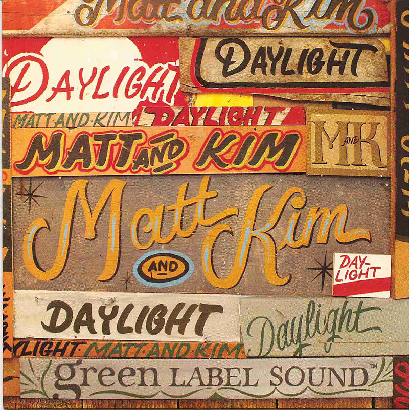
Source
This is a single's cover to a duo called Matt and Kim's song "Daylight".  I found this one very fascinating to look at, because of not only the variety of colors, but some of the typography choices they made and the placement of each of the pieces.  For me, the viewer can tell very easily what the name of the duo and song are still (even though some of the content is repeating and hierarchy may be tested).  I think my favorite "pieces" would be the monogram version of their name and the Matt and Kim that's golden and is the most prominent; then the Daylight that is scripted and green (near where the Green Label Sound is - though it's very cool as well).  I believe that each of these stand out on their own, but yet feel like the cover would be missing without one of the them.